Background
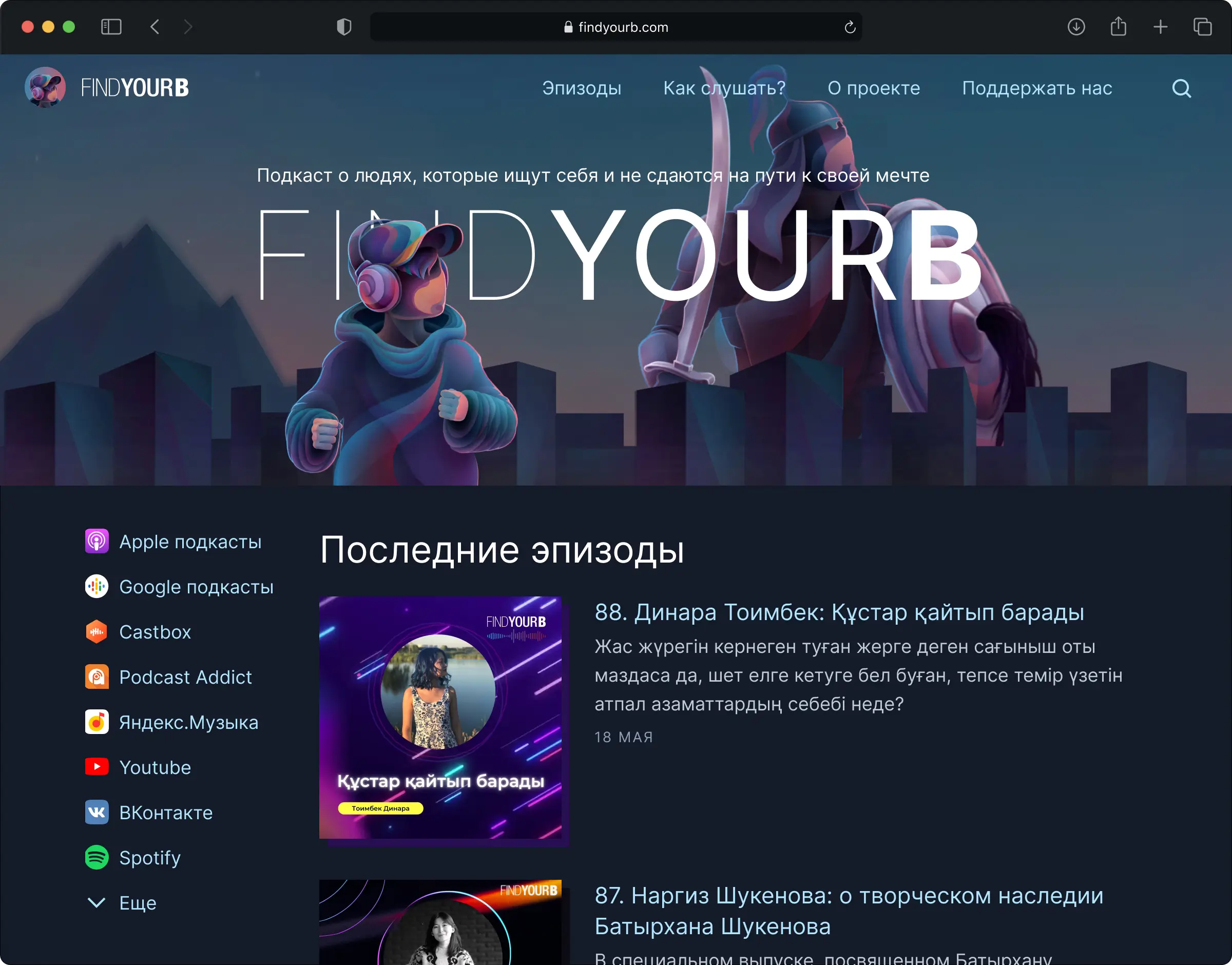
FindyourB is a podcast about people who found inspiration in life and dedicated themselves to it. The goals of the redesign were:
- Reconcile the website look and feel with brand key visuals. Make the website stand out and not be "another wordpress site".
- Clean up visual clutter and make it easier for users to find episodes.
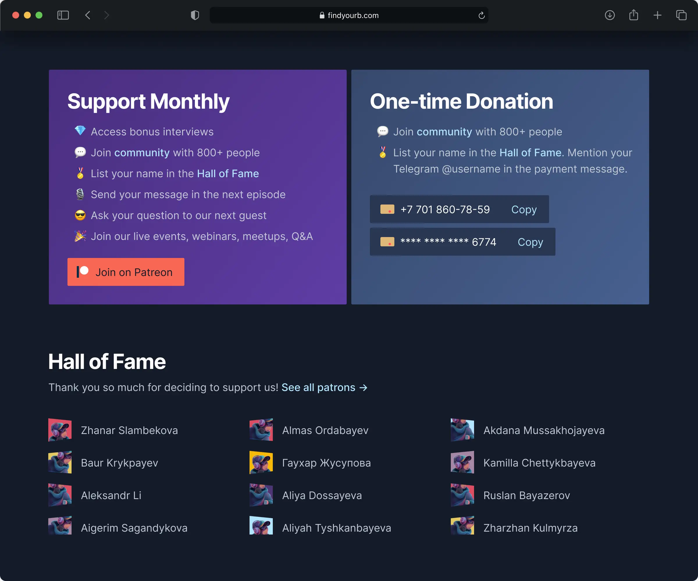
- Advertise Patreon subscription, so that number of supporters grow.
My role
I worked directly with the founder and collected requirements, created low and high fidelity designs, aligned the team around them, and co-developed the website.
Design
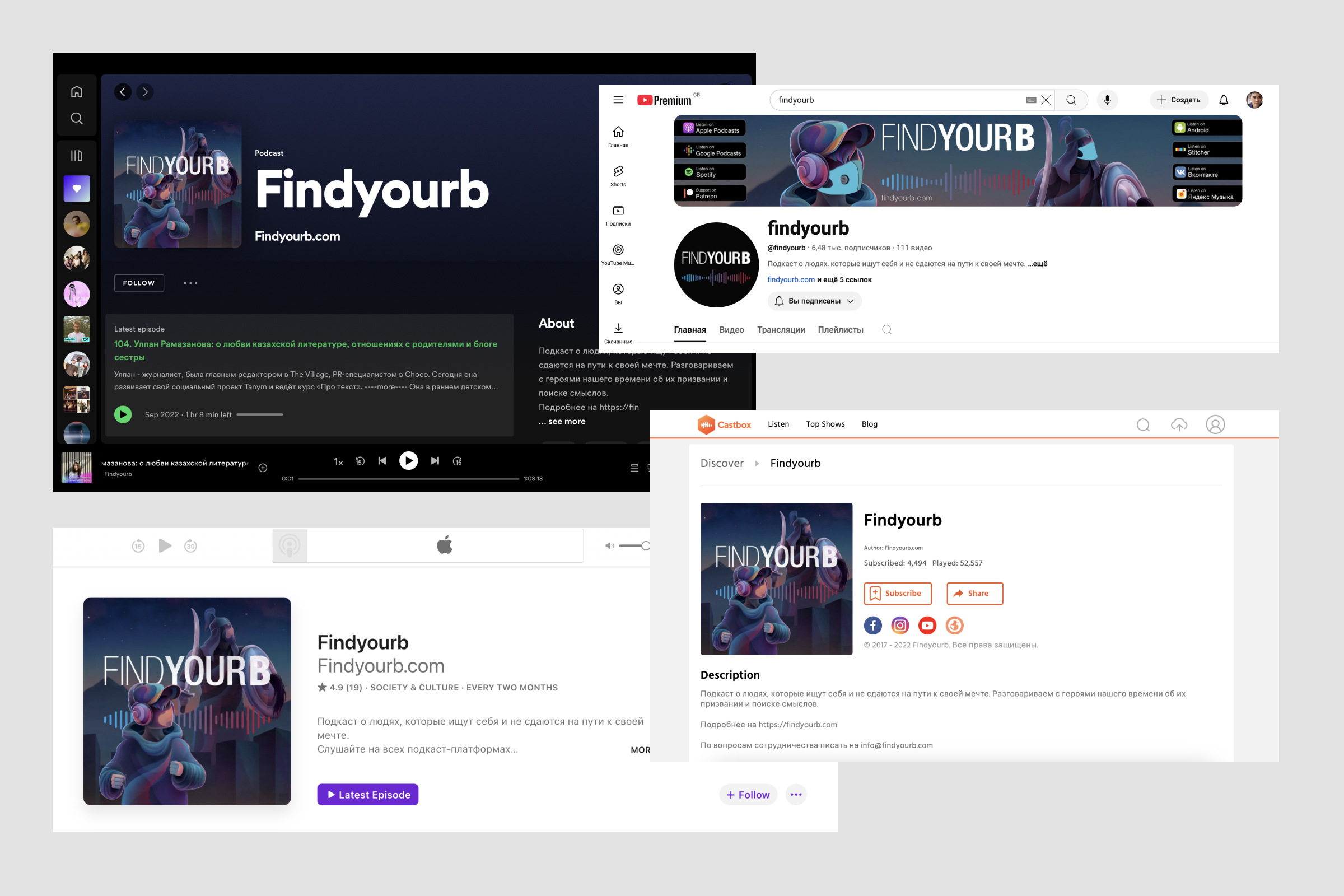
I suggested an approach to the new website design based on the visuals and covers founders already used for podcast platforms, to achieve consistent look and feel.
Asking users for support
At the index page and after each episode there is the module suggesting users to support the podcast via Patreon or directly by bank transfer. For each option the benefits are described, so that users can decide if it is worth it. Also, patrons who pledged the most are acknowledged below:
Honor to patrons
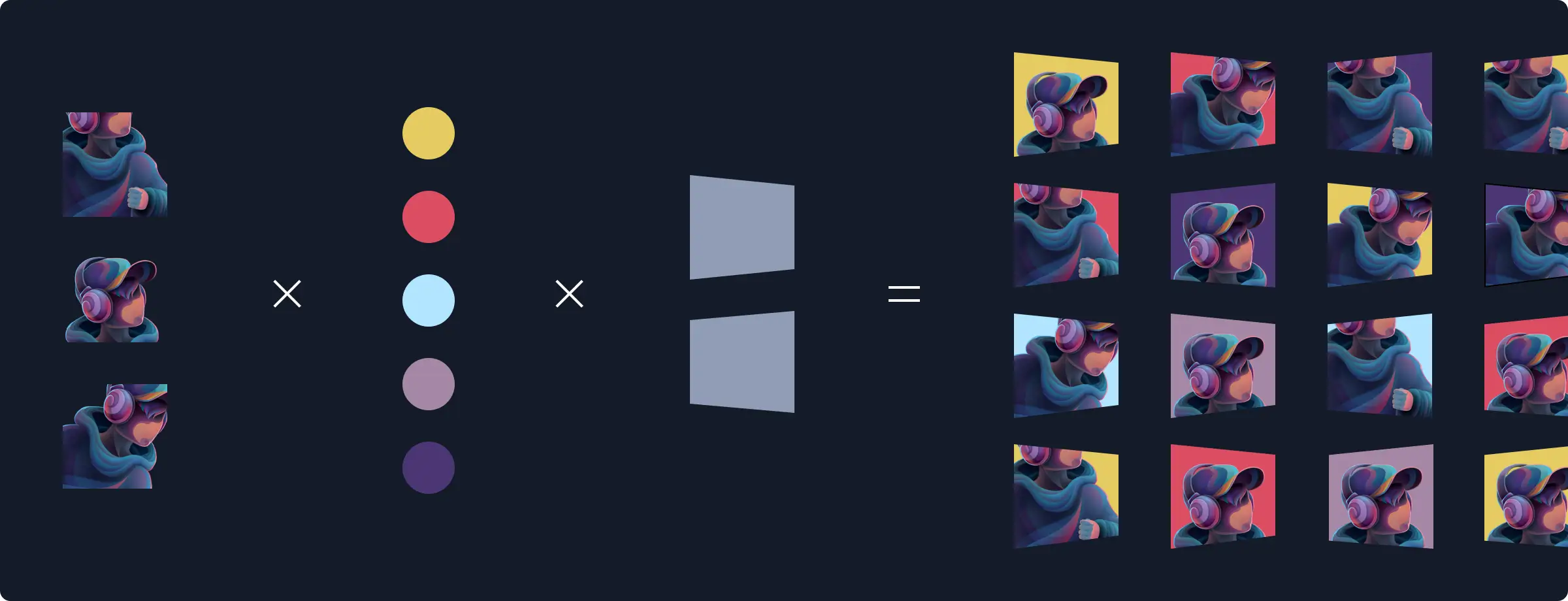
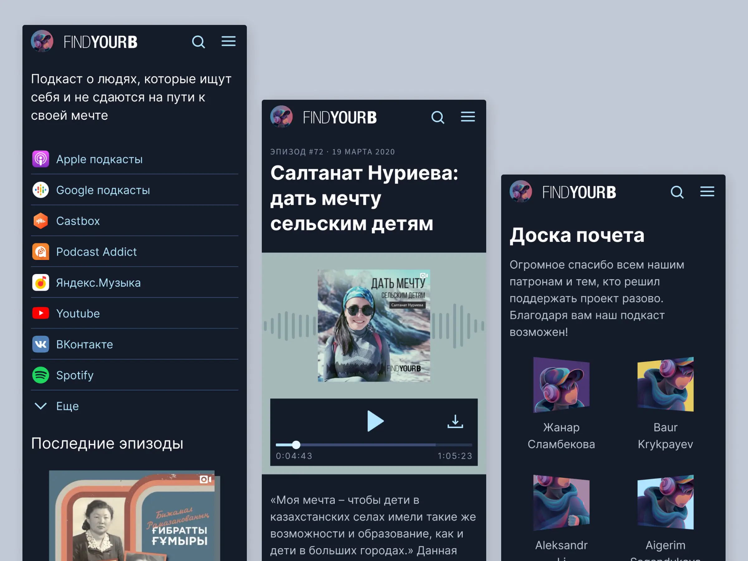
Initially we wanted to show the Patreon userpic for each patron, so patrons can recognize themselves, but it did not fit the scope before the website release. A workaround I came up with a set of distinct placeholders:
Mobile version
While for desktop there is the coloful visual animated with parallax effect to convey the podcast vibes, the mobile version is simplified to make essential functionality more accessible.
Thanks naffiq for the opportunity to work on it.